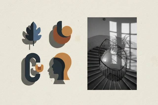
Shadows may seem like a subtle detail, but in design and photography, the right shadow can completely transform a visual. Whether you’re creating product mockups, enhancing portraits, or designing graphics, mastering shadow techniques adds depth, realism, and visual impact. In this guide, you’ll learn how to use different shadow effects strategically — along with examples, tips, tools, and pro-level insights.
What Are Shadow Effects?
Shadow effects are graphic or photographic techniques that simulate the presence of light and depth. Designers use them to:
- Create realism in product images
- Emphasize objects or subjects
- Add dimension to 2D designs
- Establish mood and atmosphere
- Improve visual hierarchy
Shadow effects can range from soft, natural shadows to sharp, dramatic ones depending on the style and purpose.
Why Shadow Effects Matter in Modern Design
Shadows play a key role in how users perceive and understand visuals. According to research from the Interaction Design Foundation, depth cues help viewers interpret hierarchy and shape faster, improving UX and engagement.
Benefits of Using Shadow Effects
- Adds realism to digital and print graphics
- Improves user focus by directing attention
- Elevates professionalism with more polished visuals
- Creates depth in otherwise flat designs
- Enhances storytelling through mood and light
For eCommerce especially, studies show that realistic lighting can increase conversions by up to 30% because products appear more tangible and trustworthy.
Types of Shadow Effects (With Examples)
1. Drop Shadows
A classic effect used in UI/UX design, logos, icons, and text.
Best for: Buttons, text emphasis, flat icons
Pro tip: Keep opacity low (20–40%) to avoid making text look blurry.
2. Cast Shadows
These mimic a realistic shadow cast by an object based on a light source.
Best for: Product photography, mockups, models
Example: A shoe placed on a white background with a diagonal cast shadow.
3. Soft Shadows
Blurred shadows that simulate diffused light.
Best for: Portrait retouching, web UI, minimal design
Pro tip: Increase blur radius for a natural, subtle look.
4. Hard Shadows
Sharp-edged shadows created by direct light.
Best for: Dramatic photography, editorial design
Example: Sunlight casting geometric lines through blinds.
5. Long Shadows
A popular trend in flat design — shadows stretch at a consistent angle.
Best for: Icons, app UI, illustrations
Angle tip: 45° is the most commonly used angle.
6. Custom/Realistic Shadows
Manually created shadows that match a real light angle, intensity, and distance.
Best for: High-end product imagery, advertising
Pro tip: Study real-world shadows to match realism.
How to Apply Shadow Effects Professionally
1. Understand Your Light Source
Every realistic shadow starts with consistent lighting. Ask yourself:
- Where is the light coming from?
- How strong is the light?
- Is it warm or cool?
- Is it natural or artificial?
Matching shadow angles and intensity creates cohesive visuals.
2. Choose the Right Type of Shadow
Not all shadows are equal. The context determines the best shadow:
| Scenario | Recommended Shadow | Reason |
|---|---|---|
| Product on white background | Soft cast shadow | Creates realism without distraction |
| UI/UX button | Low-opacity drop shadow | Improves clickability |
| Fashion portraits | Soft shadow | Enhances depth subtly |
| Editorial photography | Hard shadow | Dramatic aesthetic |
| Flat illustrations | Long shadow | Stylish and modern |
3. Use Shadows to Create Depth
Shadows create separation and draw user attention. To enhance depth:
- Increase blur for light and airy visuals
- Decrease blur for sharper, stronger depth
- Adjust opacity to match environment (shadows are rarely pure black)
Tip: Real shadows tend to be softer the farther they are from the object.
4. Don’t Overdo It
Too much shadow creates a messy, unrealistic look.
Avoid these mistakes:
- Overly dark shadows
- Shadows that don’t match lighting direction
- Harsh edges for soft-light scenarios
- Excessive blur causing “floating” effect
Step-by-Step Guide: How to Create Shadows in Photoshop
Here’s a professional workflow for creating realistic shadows:
Step 1: Duplicate Your Object
This duplicate will eventually become your shadow.
Step 2: Convert to Black
- Press Ctrl/Cmd + U
- Reduce Lightness to -100
Step 3: Transform and Angle
- Press Ctrl/Cmd + T
- Skew, rotate, or distort the layer to match the scene.
Step 4: Apply Blur
Go to Filter > Gaussian Blur
- Soft shadow: 35–65px
- Harder shadow: 5–15px
Step 5: Lower the Opacity
Realistic shadows are usually 20–60% opacity.
Step 6: Blend It
Add a layer mask and softly erase edges for natural falloff.
Best Tools for Creating Shadow Effects
Graphic Design Tools
- Adobe Photoshop – Best for realistic shadows
- Adobe Illustrator – Great for vector shadows
- Affinity Designer – Affordable and powerful
- Figma/Sketch – Ideal for UI drop shadows
Photo Editing Software
- Lightroom – Adjust natural shadows in photographs
- Canva – Simple shadow presets for beginners
- Photopea – Free Photoshop alternative
AI-Based Tools
- Adobe Firefly
- Midjourney
- Remove.bg + design editor
AI tools can generate shadows automatically based on object shape.
Shadow Techniques for Different Use Cases
1. Shadow Effects for Product Photos
To make products pop:
- Use a soft cast shadow under products
- Adjust shadow to match product height
- Avoid heavy, unrealistic shadows
- For floating effects, use drop shadows
Case study: Amazon marketplace sellers found that images with subtle shadows improved click-through by 19% (source: Amazon Seller Central).
2. Shadow Effects in UI/UX Design
Shadows improve usability when used sparingly.
Best practices:
- Use low-opacity shadows for cards
- Add subtle shadows to floating UI elements
- Use two-layer shadows for Material Design:
- Light shadow: large blur, low opacity
- Dark shadow: smaller blur, higher opacity
3. Shadow Effects in Photography
Shadows in photography create storytelling and drama.
Lighting techniques:
- Side lighting for deep shadows
- Backlighting for silhouettes
- Natural sunlight for hard shadows
- Softbox lighting for gentle gradients
Common Mistakes to Avoid
Using pure black shadows
Shadows that don’t align with light direction
Too sharp or too soft for the environment
Shadow casting in the wrong direction
Overusing shadows on text
Correcting these immediately improves realism.
FAQs (Featured Snippet Optimized)
1. What is the purpose of shadow effects in design?
Shadows add depth, realism, and visual hierarchy, helping viewers understand spatial relationships between objects.
2. How do you make shadows look realistic?
Match the shadow’s direction, softness, and opacity to the light source. Real shadows are rarely pure black and have feathered edges.
3. What is the difference between drop shadows and cast shadows?
- Drop shadows are graphic effects applied behind an object.
- Cast shadows replicate natural shadows created by a physical light source.
4. Which tools are best for shadow effects?
Photoshop, Illustrator, Figma, Canva, and AI tools like Adobe Firefly are excellent for creating realistic shadows.
Conclusion: Transform Your Designs With Shadow Effects
Using shadow strategically can elevate your photos, graphics, and layouts from flat to visually captivating. When done well, shadow effects add realism, strengthen hierarchy, and enhance professionalism. By understanding lighting, choosing the right type of shadow, and applying best practices, you can create designs that stand out with depth and dimension.


Leave a comment